Project Peace
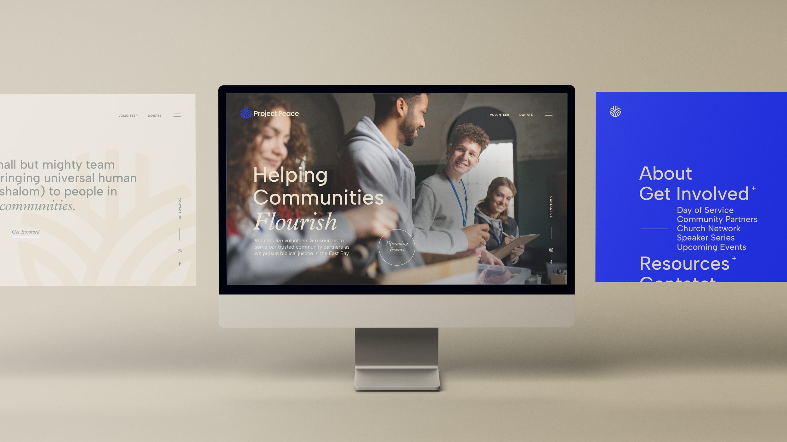
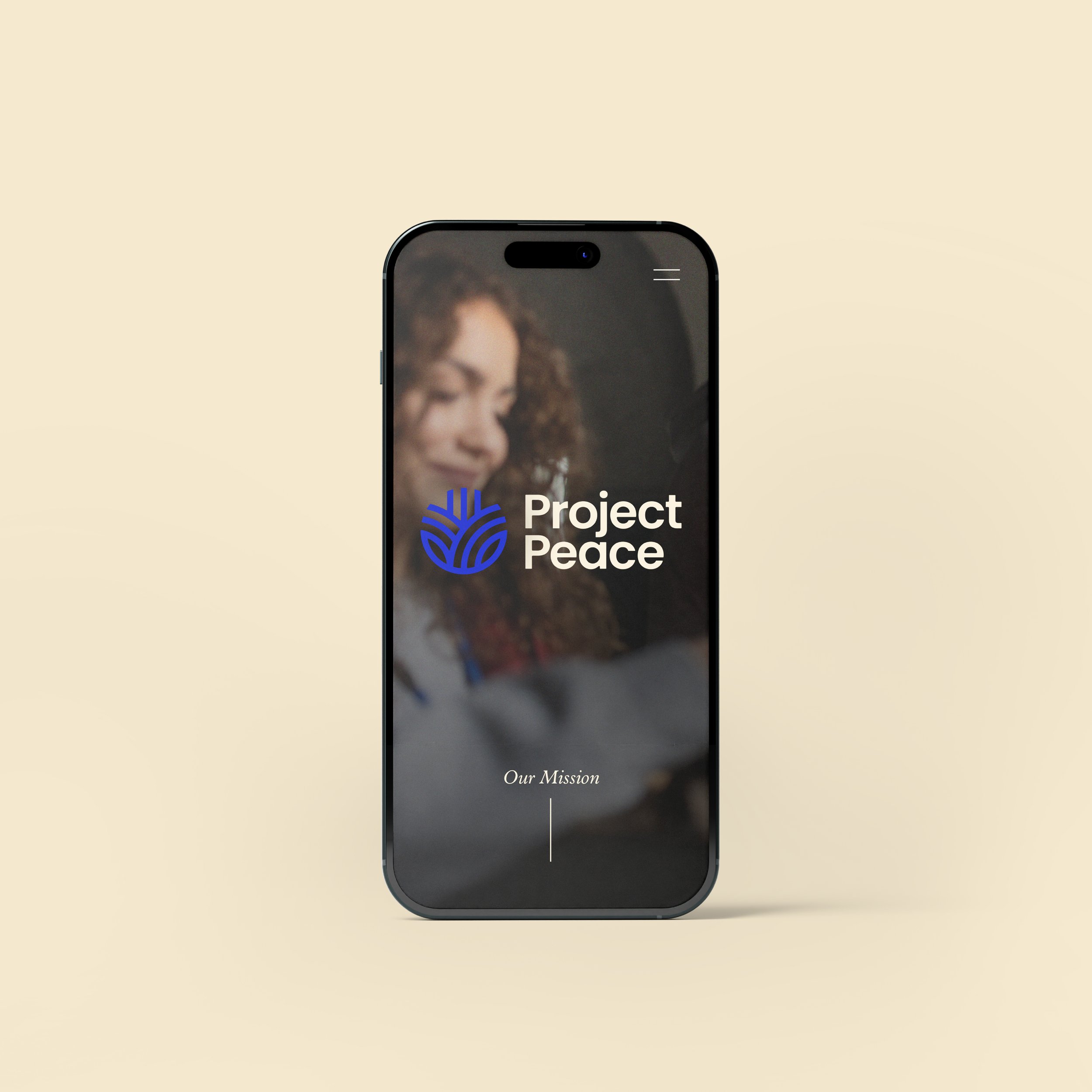
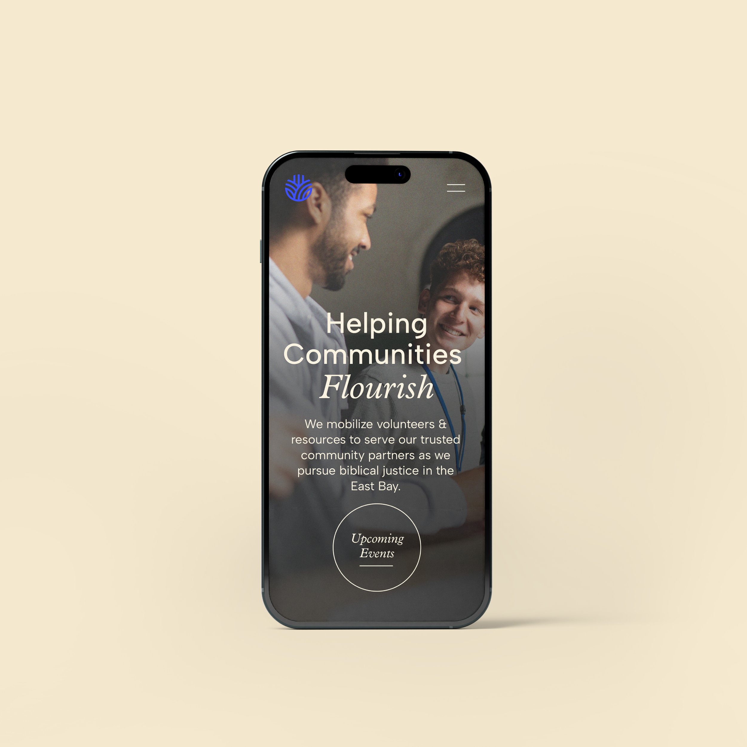
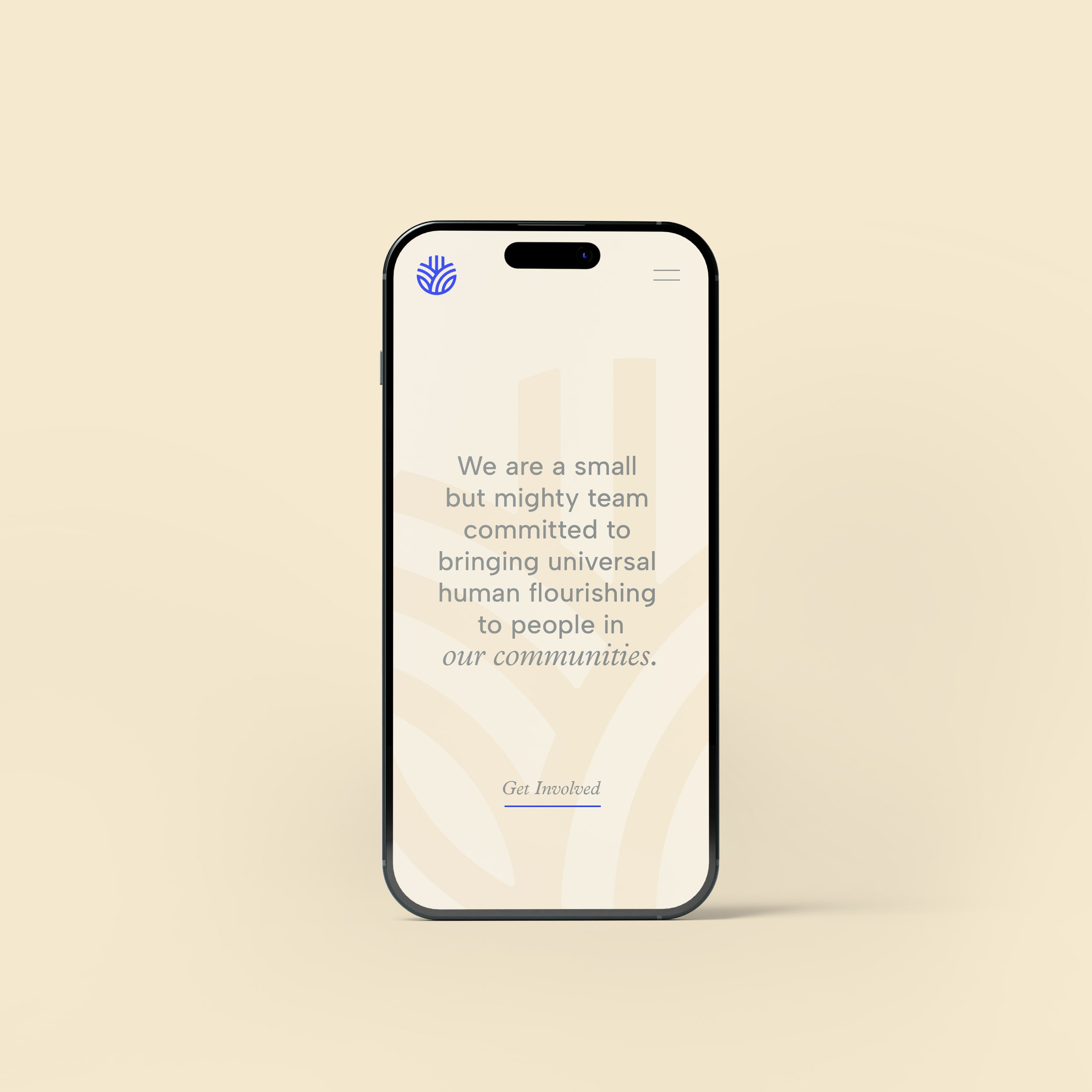
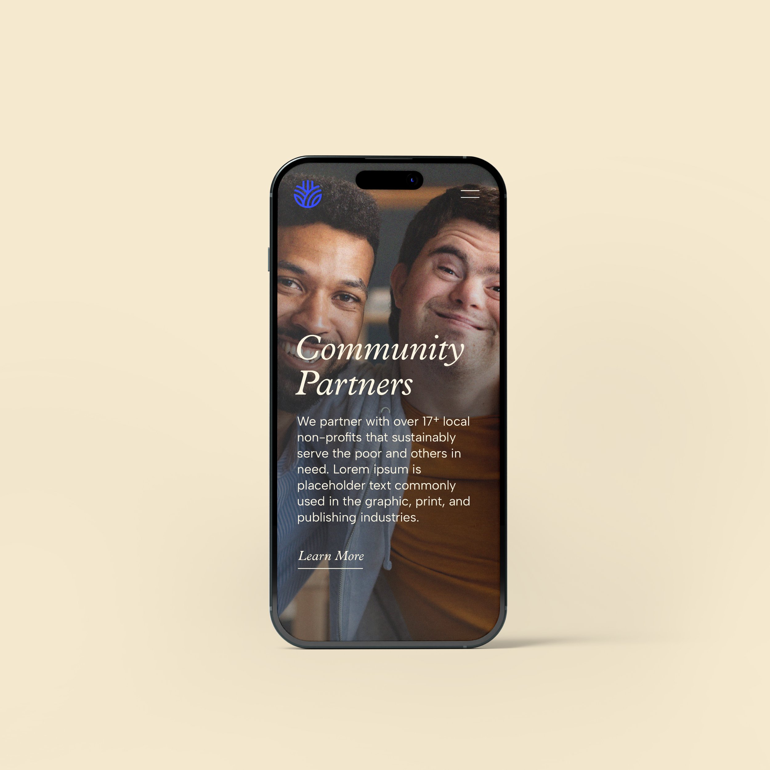
Project Peace is a small but mighty team committed to serving the members of their community who are in greatest need. Based out of Oakland, California, this non-profit group mobilizes volunteers & resources to serve their trusted community partners as they give back to the East Bay Area.
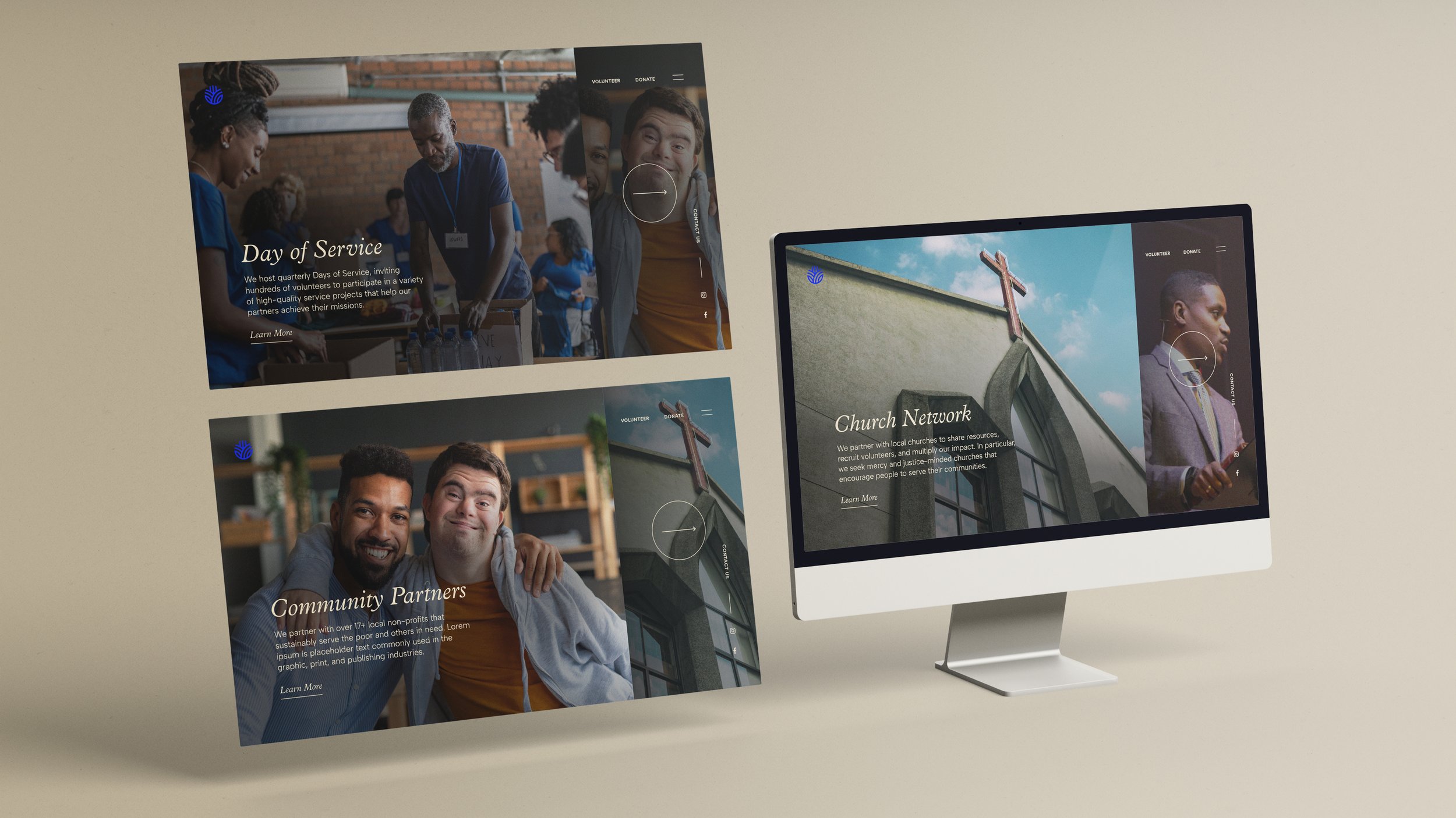
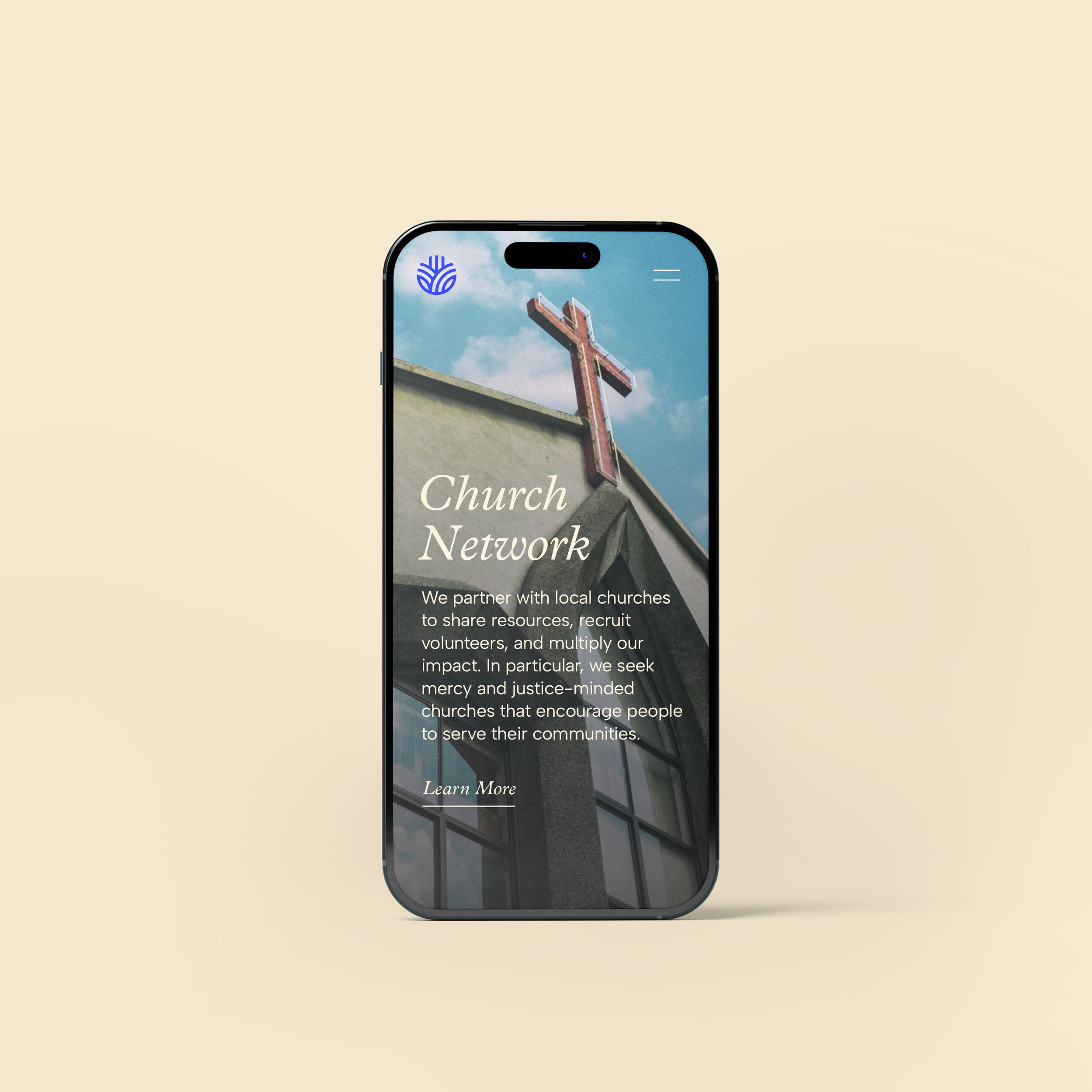
Apart from its community service objectives, Project Peace strives to actively educate the community through their Speaker Series events hosted within the organization’s church network. Together, they can identify and discuss the causes of deep-rooted and pervasive inequality in the East Bay (from a center of faith) and actively advocate for just systems and policies within their local contexts.
Services:
Brand Identity + Web Design + Print Collateral
Role:
Senior Designer at Design In Mind
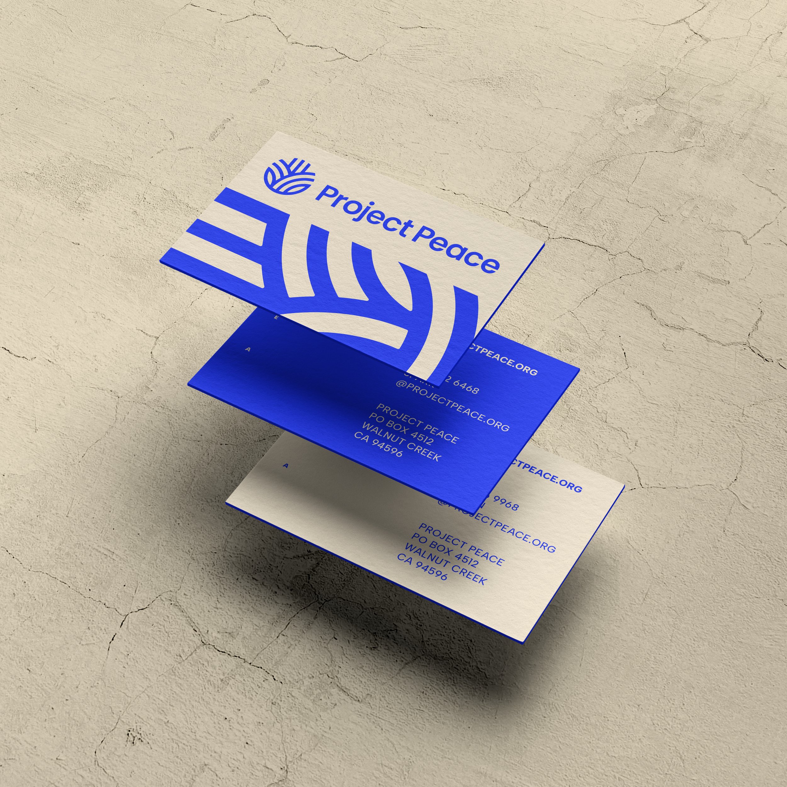
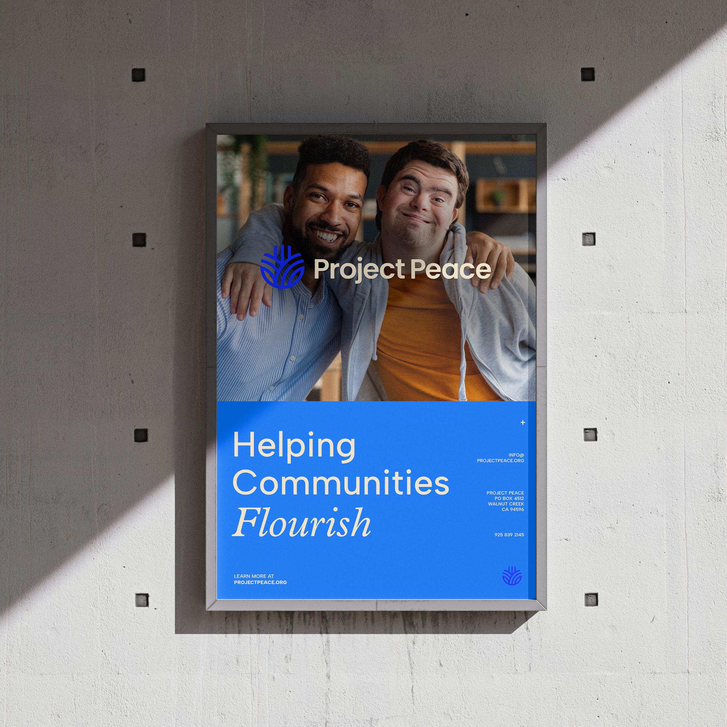
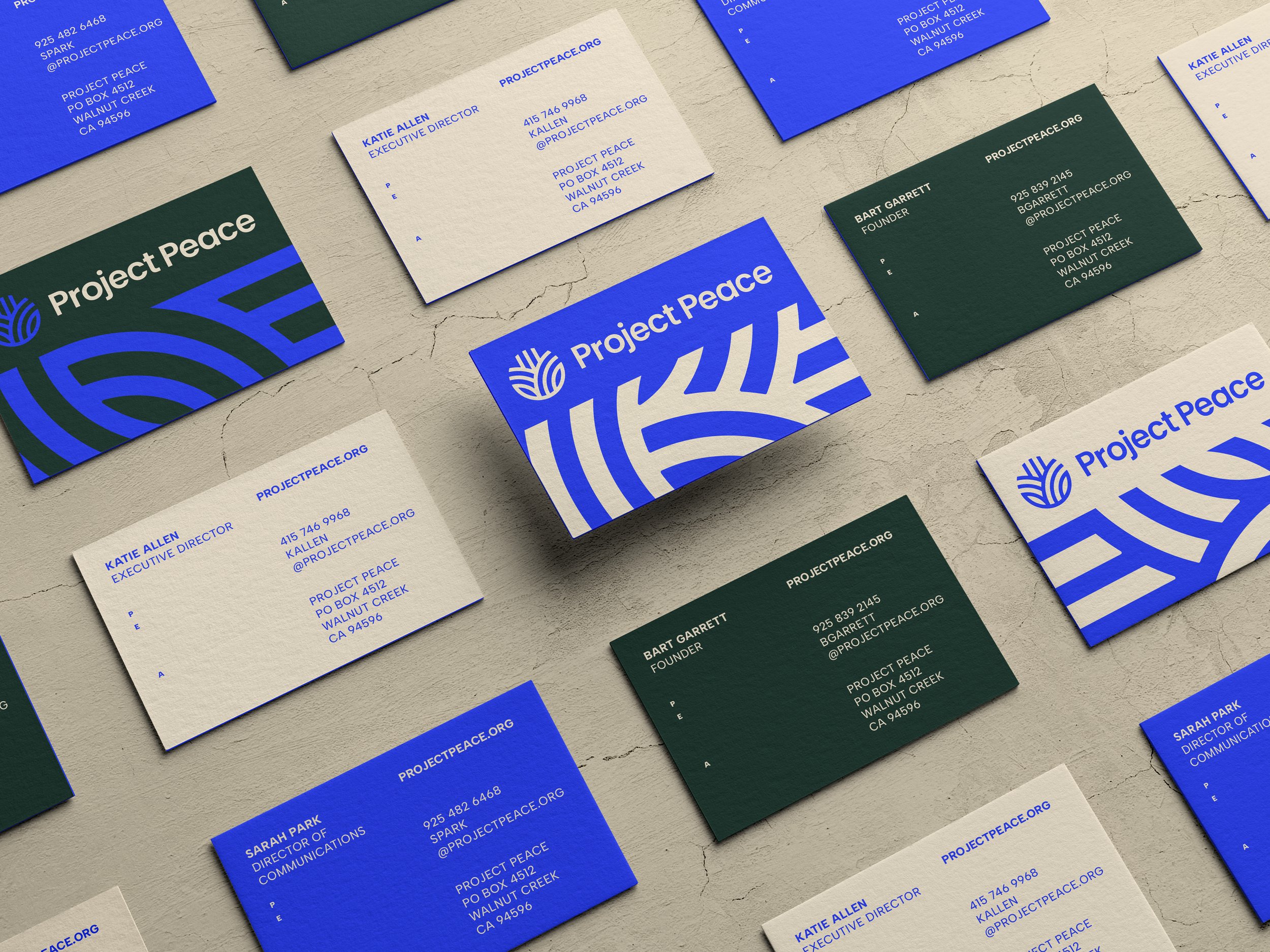
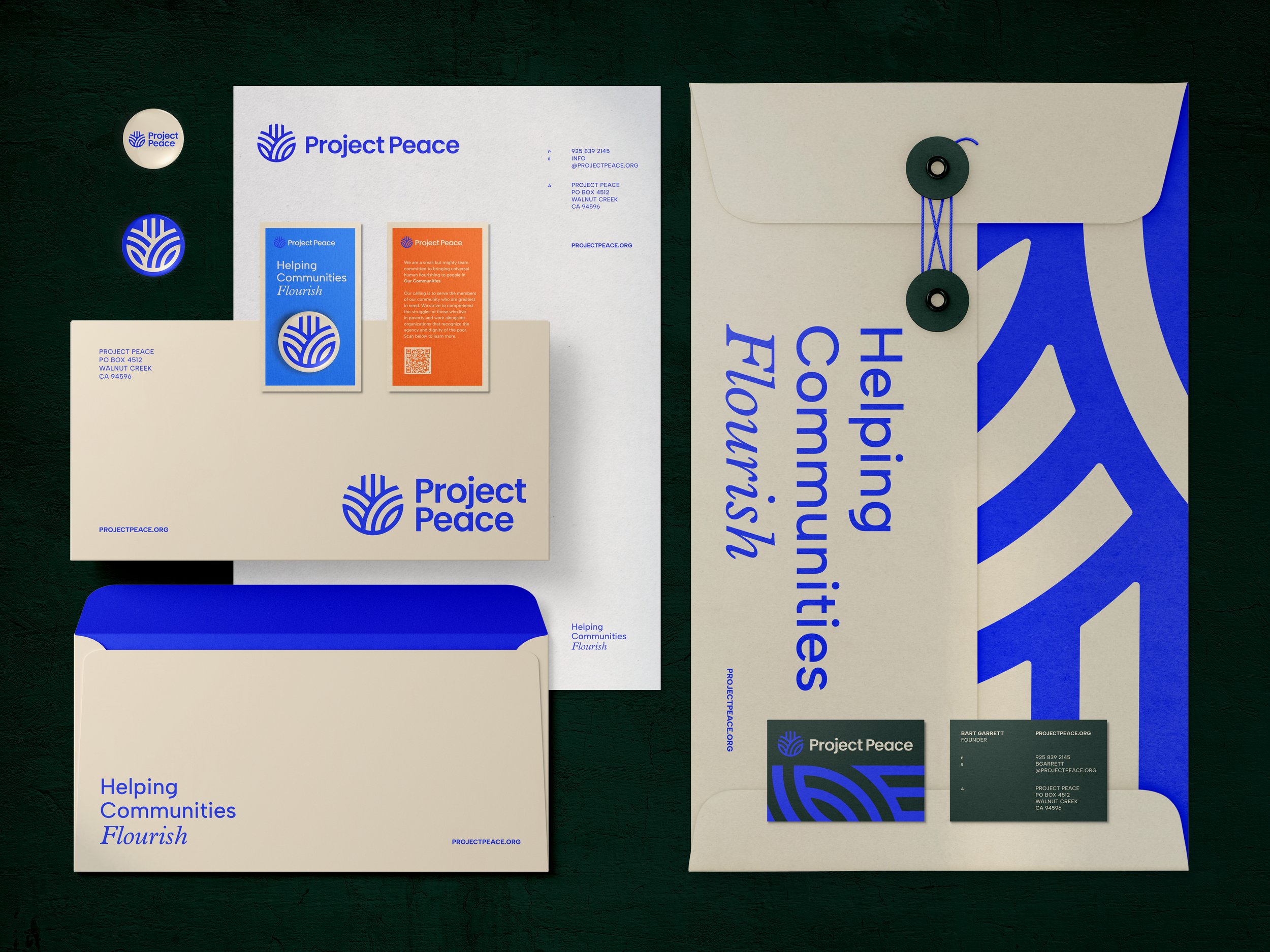
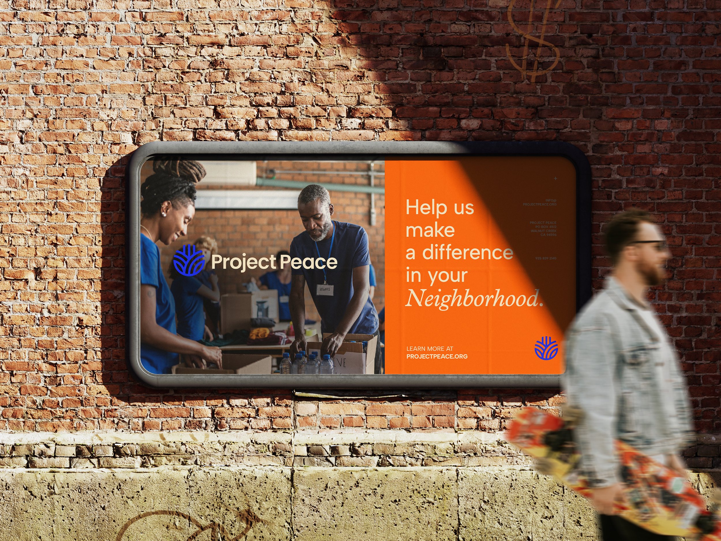
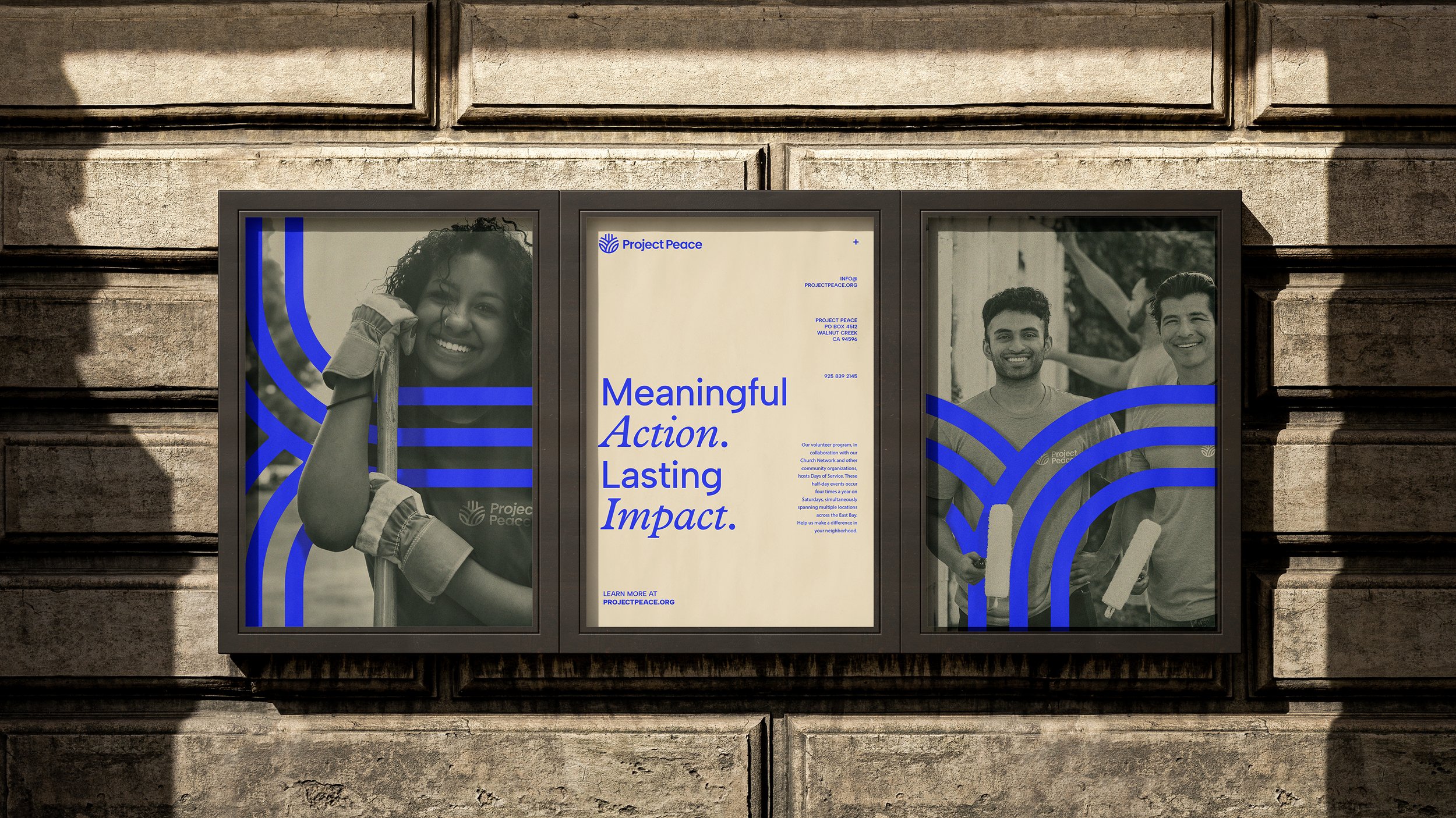
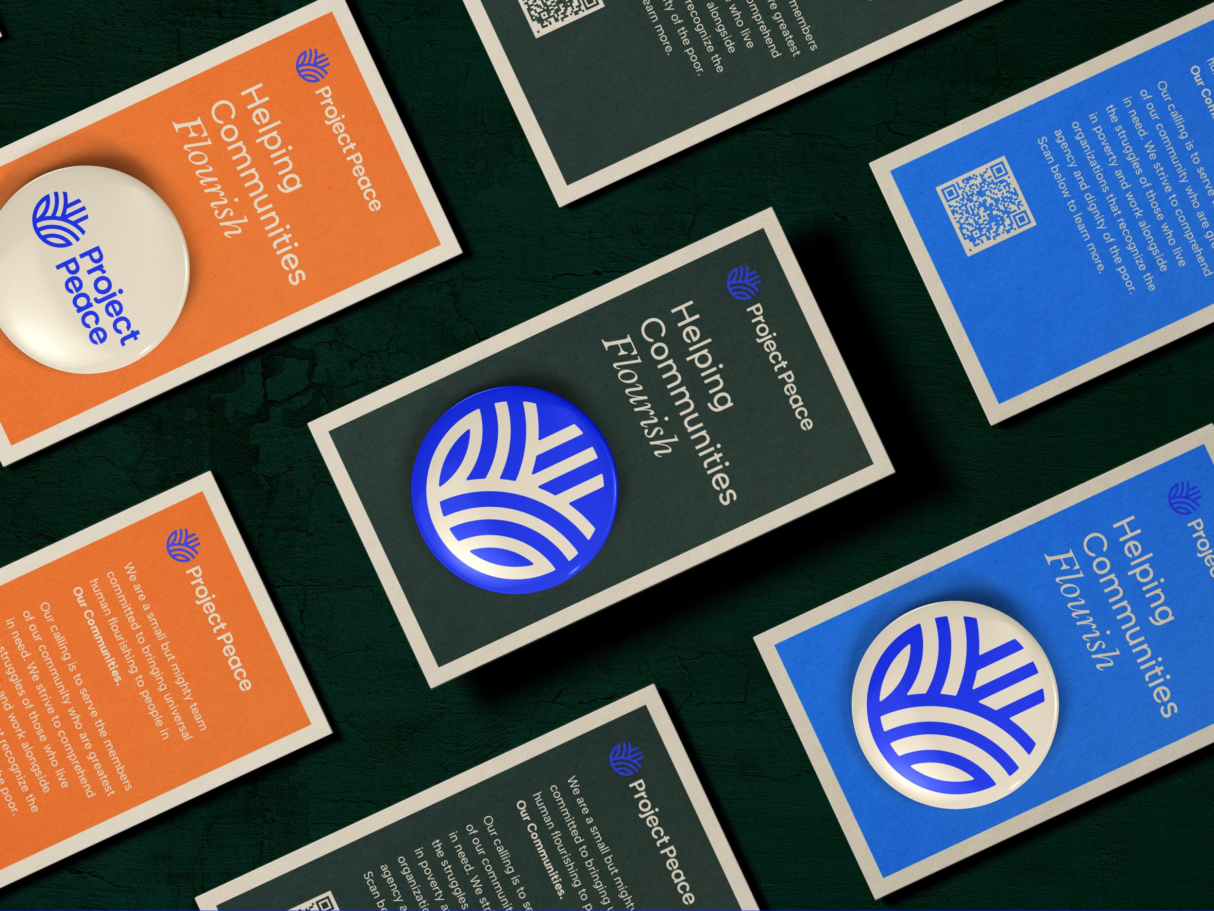
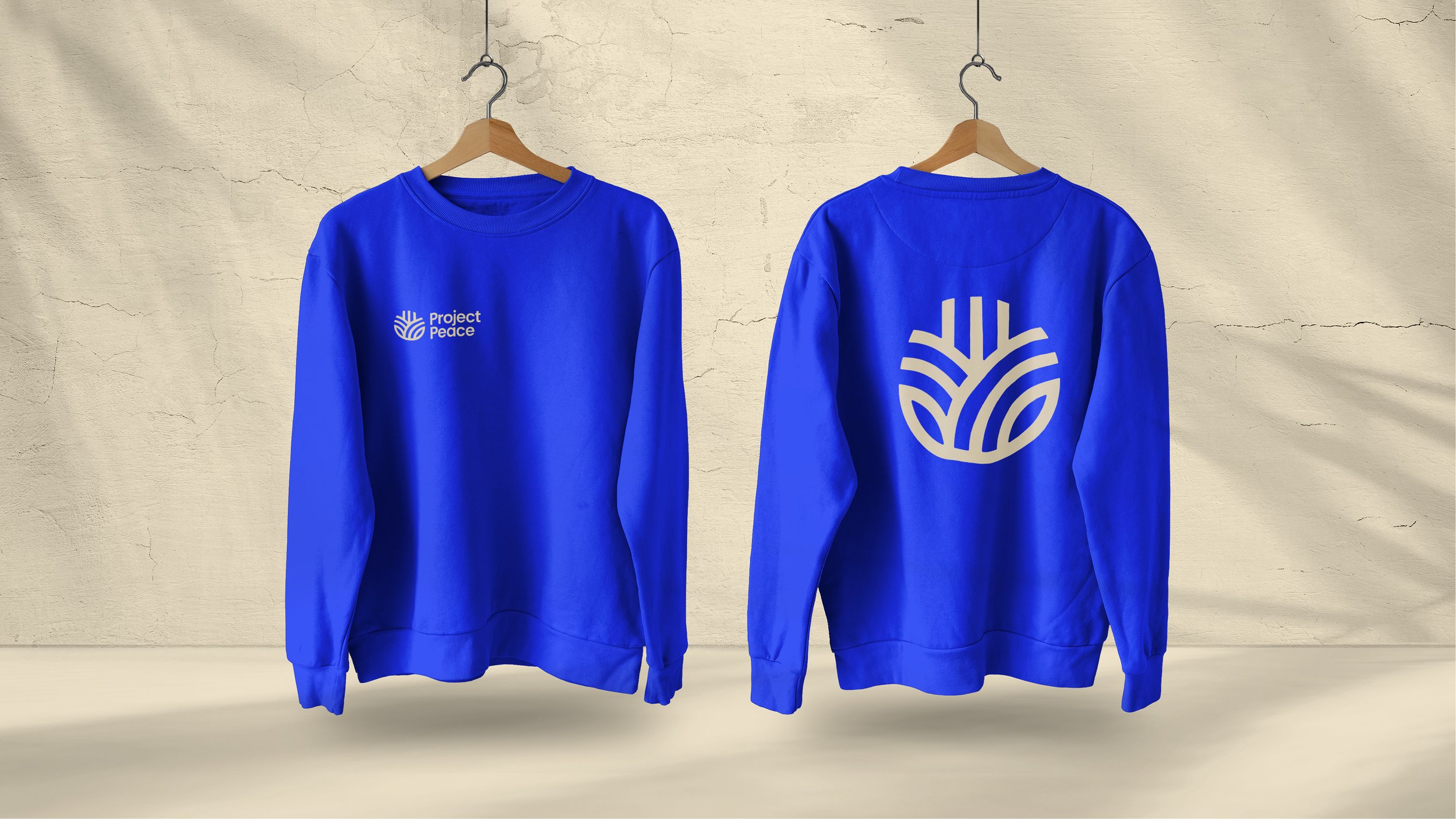
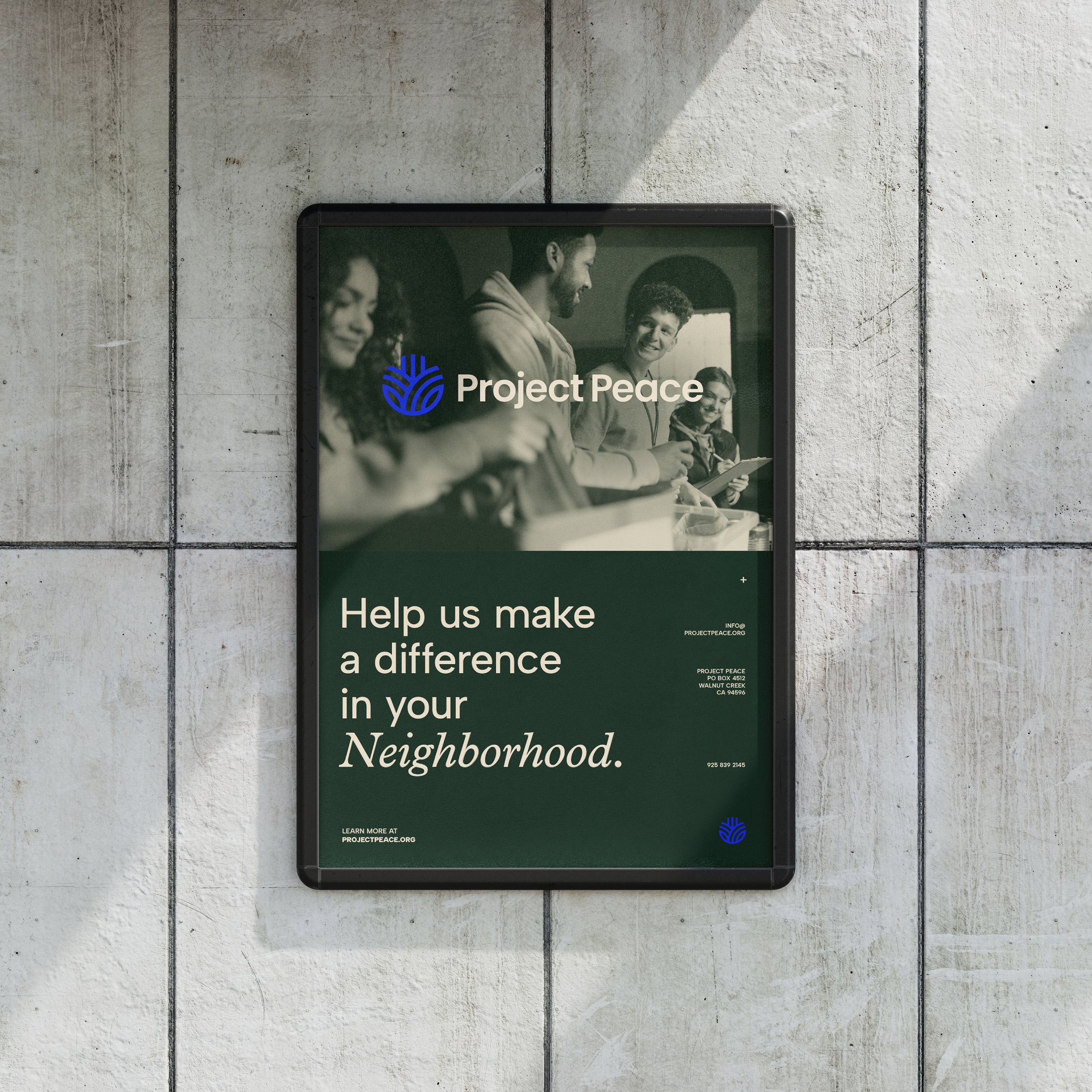
Our primary goal with Project Peace was to rejuvenate the soul and energy of the brand and establish a more modern look and feel to help elevate its presence in the East Bay Area. By evolving their primary color palette we were able to establish a much louder impact. To preserve some brand recognition, we chose a new, more vibrant blue as their hero color, and balanced it with natural, earth tones that allude to the nature of their volunteer work — and their “not afraid to get our hands dirty” attitude. In addition, we built out a secondary palette of supporting colors to voice the personality and approachability of the brand.

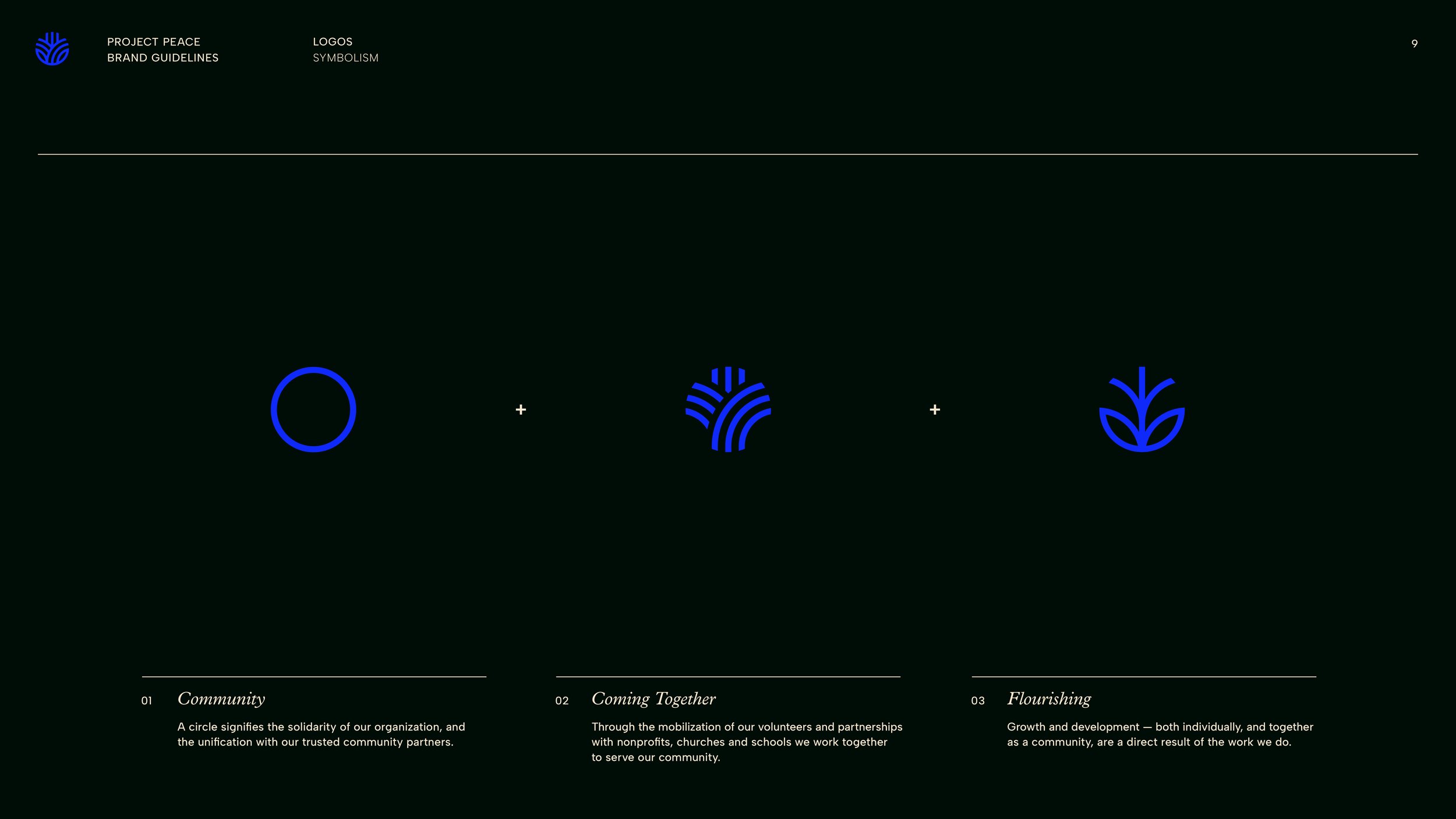
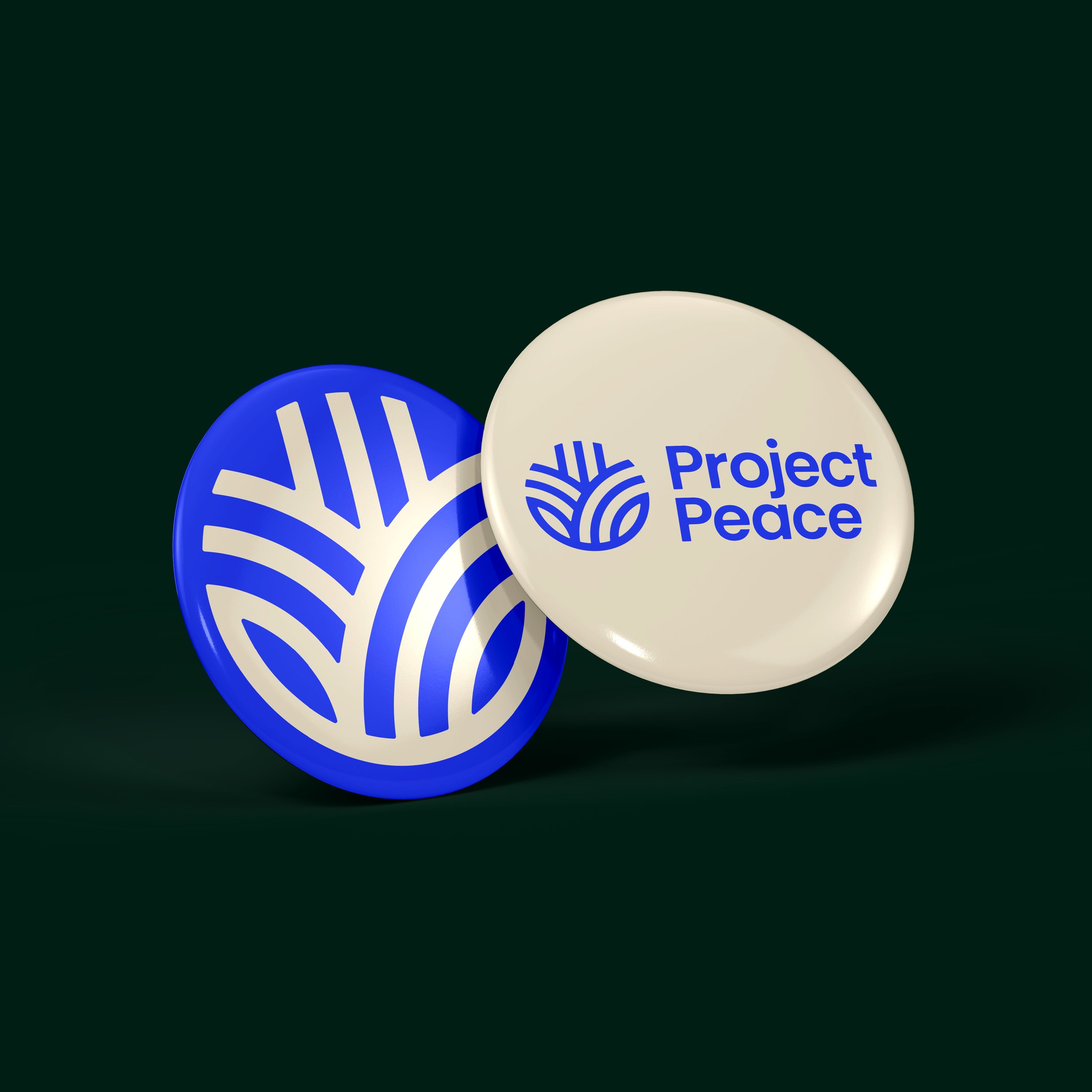
Another large piece of the puzzle was the development of a logomark that adequately symbolizes the brand’s core principles in a sleek and modern, but not necessarily overt fashion. We chose to harness the focus on “community,” a sense of “coming together,” and “flourishing” — both individually, and as a group. By combining iconic representations of each of these principles, we found a visual solution that was simple, but elegant in form — and could stand alone as an identifiable representation of the brand.
